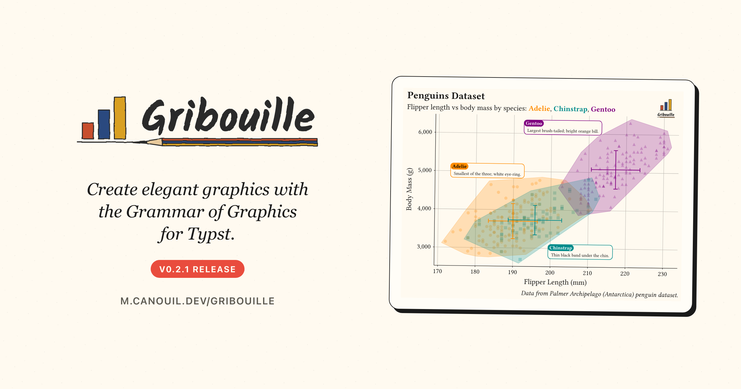
Gribouille 0.2.0 and 0.2.1: Composing Plots and a Sturdier Core
Gribouille 0.2.0 is the first feature update since the launch, and 0.2.1 follows shortly after. compose() can now number panels, nest, carry its own titles, hoist a single shared legend, and line panels up across the grid with align-panels, facet-grid() gains free scales, and labels and guides get tidier controls. Most of the work, though, went into the internals, where a long list of panics became clear errors and correct output.
Gribouille shipped its first version a fortnight ago. This is the first feature update: 0.2.0 landed first, and 0.2.1 followed shortly after with align-panels and two more fixes, so this post covers the 0.2 update as a whole. It has two faces. On the surface, compose() learned to number, nest, title, share a legend across panels, and line those panels up across the grid, facet-grid() got free scales, and labels and guides became easier to control. Underneath, most of the time went into the internals, turning a long list of panics into clear errors and correct output.
Every figure in this post is a real, freshly compiled plot.
NoteAt a glance
Gribouille 0.2.1 on Typst Universe: #import "@preview/gribouille:0.2.1": *.
compose() can tag panels (A, 1, i, …), nest into another compose(), carry its own labs, control the shared legend through guides, and size itself with width/height and relative widths/heights.
compose(align-panels: true) shares panel margins grid-wise, so the plot areas line up across rows and columns even when their axis labels differ in width (0.2.1).
A layer’s data accepts a function applied to the plot data, for per-layer subsets or transforms without a second dataset.
guides() gains a default entry, a fallback inherited by every aesthetic without its own override.
labs() fields default to auto; pass none to drop an axis or legend title and reclaim the space it reserved.
A long internals pass: many operations that used to panic now report a clear error or handle the edge, after-scale/stage channels resolve correctly, and geom-segment()/geom-curve()/geom-ribbon()/geom-area() draw on discrete scales instead of nothing (0.2.1).
Every {typst} block below pulls the library in through a one-line preamble, #import "@preview/gribouille:0.2.1": *, exactly as the launch post explained.
2 Compose grew up
The launch already had compose(): pass a few deferred plots, get them laid out on a grid with their shared legend hoisted to the edge. This release turns it into a small layout language of its own, close in spirit to patchwork.
Panels can be numbered with tag-levels, the composition can carry its own title through labs, and the shared legend’s side is set once with a default guide.
x: none and y: none drop the per-panel axis titles and give the space back to the data.
2
defer: true returns a spec instead of drawing, so compose() can place it.
3
tag-levels: "1" numbers the panels in order; "A", "a", "I", and "i" give the other styles.
4
The default guide sets the legend side once, and every aesthetic without its own guide inherits it.
5
A composition-level labs() writes one title above the whole figure.
Three things here are new. tag-levels, with tag-prefix, tag-suffix, and tag-corner, labels each panel and styles the tag through a new plot-tag theme element. A composition now accepts its own labs (title, subtitle, caption) and alt text, so the figure reads as one unit. The shared legend is steered through guides instead of the old guides-placement argument, which is removed.
TipNesting
A compose() call also accepts defer: true, so it can become a panel inside another compose(). A per-depth tag-levels array then continues the numbering down the tree, giving tags such as B.1 and B.2.
The 0.2.1 release adds one more control and tidies the tags. By default each panel keeps its own margins, so when one panel carries wide axis labels and another narrow ones, their plot areas start at different offsets and never quite line up. align-panels: true shares the margins grid-wise, left and right per column, top and bottom per row, so the data areas align across the grid the way patchwork and cowplot do. The panel tags also reserve their own band now, sitting above each panel instead of overlapping the data.
align-panels: true makes the two plot areas share a left edge, even though the four-digit body-mass labels are wider than the two-digit bill-length labels.
2
The tags now reserve their own band above each panel instead of overlapping the data.
3 Free the facet scales
facet-grid() used to share one pair of axes across every panel. It now takes a scales argument, matching ggplot2: "free_x" frees the x-axis per column, "free_y" frees the y-axis per row, and "free" frees both. Non-positional scales such as colour stay shared, and the panels keep an equal size.
Each row now picks its own y-range, so a group sitting in a narrow band no longer wastes most of its panel on empty space.
4 Highlight a subset without a second dataset
A layer’s data now takes a function as well as a frame. The function receives the plot data and returns the rows that layer should draw. So one dataset can feed a faint base layer and a sharp highlight on top, with no second table to keep in step.
#plot( data: penguins, mapping: aes(x:"flipper-len", y:"body-mass"), layers:( geom-point(size:2pt, alpha:0.35), geom-point(1 data: rows => rows.filter(r =>{letmass= r.at("body-mass", default:none) mass !=none and mass >=5500}), size:3pt, colour: rgb("#D55E00"),),), labs: labs( title:"One Dataset, One Layer Highlighted", x:"Flipper Length (mm)", y:"Body Mass (g)",), theme: theme-minimal(), width:12cm, height:8cm,)
1
The function gets the plot data as an array of rows and returns the subset to draw, here the penguins at 5,500 grams and above.
The same trick covers per-layer transforms, not just filtering. Return a reshaped frame and that layer draws it, while the rest of the plot keeps the original data.
5 Tidier labels and guides
Two smaller changes remove a recurring annoyance.
First, every labs() field defaults to auto. Passing none now drops an axis or legend title and reclaims the margin it reserved, instead of leaving an empty gap. element-blank() on a text surface does the same from the theme side.
Second, guides() takes a default entry. It holds the fallback guide options, the legend side most often, and any aesthetic without its own guide inherits from it. You saw it above feeding the shared legend in compose(); it works the same on a single plot(). Legend labels also honour the legend-text alignment now, and element-text()/element-typst() gained an align argument and a working angle, so tick labels and titles rotate as asked.
6 The heavy lifting was underneath
The list above is the visible part. The larger share of this release is a pass over the internals, and it is the kind of work that does not show up in a screenshot.
A whole class of inputs that used to crash the compile now behaves. A geom-col() on a continuous axis with a single distinct value, an empty values array in a scale-*-manual(), a non-positive bins, a sparse contour grid, or width: auto on an unbounded page: each of these used to panic, and each now either draws or reports a clear, actionable error.
Most of the 0.2 work is invisible: the figures look the same, but far fewer inputs make the compiler give up.
A second group is about getting the right answer rather than not crashing.
after-scale and stage channels now train on the marker’s source column, so grouped geoms such as geom-smooth(), and geom-errorbar() or geom-rug(), resolve a mapped colour instead of panicking.
A column mapped to both a positional and a grouping aesthetic, for example aes(x: "species", fill: "species"), now resolves the grouping across aggregating stats instead of drawing every mark in the ink colour with an empty guide.
Number formatters round correctly, so 0.9999995 no longer renders as 0.1, and continuous scales honour an explicit breaks.
A third group, and a big one, is about layout space: what a plot reserves, and what it reclaims when it is not needed. The labs(none) and element-blank() controls shown above are the visible handles, but most of the work was below them, deciding how much room each part of a figure should take.
A standalone plot no longer keeps a fixed empty margin on its top and right edges; the panel grows into that space.
A missing axis title reclaims the band it would have reserved, on the x-axis side as well as the y-axis side.
width and height now bound the whole image, title, subtitle, caption, and background padding included, so the data panel shrinks to fit and long titles wrap instead of overflowing.
Legends reserve the room a label actually needs, measuring multi-line and wider-than-usual labels across swatches, size ladders, and colourbars, so nothing clips or overlaps.
None of this changes the API. Documents that compiled before still compile, and the plots that were already correct look the same. What changed is the long tail of inputs that did not.
7 Typst Render moved too
The figures here are compiled by the quarto-typst-render extension, which had its own run of releases since the launch post. Three are worth knowing about for a documentation-heavy project.
code-fold and code-summary collapse the echoed Typst source into a <details> block, so a long example does not push the figure off the screen.
Quarto code annotations now work on echoed Typst source: the // <1> markers and the numbered list under the compose() block above are exactly that feature.
output-source writes the compiled Typst source, preamble and colour bindings included, next to each saved image, which is handy when you want to reproduce a figure outside Quarto.
8 Wrap-up
A composition language on top, a sturdier core underneath.
Next on the list is more geoms, a wider set of worked examples, and feedback from the people writing Typst documents day to day.
Gribouille is an unfunded spare-time project, and the API is still settling. Bug reports and ideas are very welcome on the issue tracker. Pull requests are not being accepted for now, for the reasons set out in the launch post. Thanks in advance for your patience.