Build LinkedIn Carousels with Typst: the slide Layout
A LinkedIn carousel is just a multi-page document. This short tutorial shows how a tiny Typst slide helper gives every page a full-bleed background with consistent padding, then how to compile the deck to PDF and preview frames. It ends with a ready-to-paste LLM prompt that drafts a similar carousel from scratch.
A LinkedIn carousel is not a special thing. It is a multi-page document that the feed turns into swipeable cards, and you upload it as a single PDF. So if you can make a multi-page PDF, you can make a carousel.
Typst is a fine tool for exactly that. You describe each page in plain text, compile to PDF in a fraction of a second, and keep the source under version control like any other code. No design tool, no manual export, no moving boxes around by hand.
This post shows the one helper I use to make this easy: a small slide helper that gives every page a full-bleed background with consistent padding. Every slide shown below is a real Typst compilation, rendered to SVG by the Typst Render Quarto extension, so you see the code and its result side by side.
NoteAt a glance
This deck uses a square 1:1 page, the format LinkedIn shows carousels in.
Set the page margin to 0cm so backgrounds reach every edge.
A slide layout adds a rail, a page number, and the padding to every card.
Compile with typst compile, then upload the PDF or export PNG frames.
Setting up the page
Start by setting the page geometry once, at the top of the file.
The 21cm by 21cm size is a square 1:1. The LinkedIn image size guide recommends carousels as a square 1080 by 1080, or a 4:5 portrait. The exact dimensions do not matter, only the ratio does, so any square pair works.
The important line is margin: 0cm.
Zero page margin is the trick: the background reaches every edge, and the slide helper adds the padding back inside.
Carousel slides want colour and imagery that reach every edge, and a page margin would fence the content into a smaller box with white gutters. Removing the margin gives you the full page, and you add the padding back yourself. That is what the slide helper does.
For convenience, I keep the page geometry, a small palette, the fonts, and the slide layout in a shared preamble file.
#setdocument(author:"Mickaël Canouil")#settext(lang:"en")#setpage(width:21cm, height:21cm, margin:0cm)// ── palette ──────────────────────────────────────────────────────────────#letpaper= rgb("#f4f6f5")#letink= rgb("#0f1f1c")#letink-soft= rgb("#5a6b66")#letaccent= rgb("#1f9d72")// ── fonts (Typst built-ins, identical on every machine and in CI) ──────────#letdisplay="Libertinus Serif"#letbody="Libertinus Serif"#letmono="DejaVu Sans Mono"#settext(font: body, fill: ink, size:19pt)// ── the slide layout taught in the post ────────────────────────────────────// A full-height accent rail on the left edge and an optional page index,// stamped on every page; content sits in an inset cleared past the rail.#letslide(index:none, fill: paper, body)= page(fill: fill,{ place(left + top, rect(width:0.55cm, height:100%, fill: accent))if index !=none{ place(top + right, dx:-1.4cm, dy:1.4cm, text(font: mono, size:14pt, fill: ink-soft, index))} block(width:100%, height:100%, inset:(left: 2.6cm, right: 1.7cm, y: 1.7cm), body)})// ── ruled kicker label used by the examples ────────────────────────────────#letkicker(t)= grid( columns:(0.8cm,auto), column-gutter:0.35cm, align: horizon, line(length:0.8cm, stroke:2pt+ accent), text(font: mono, size:13pt, weight:"medium", fill: ink-soft, tracking:1.5pt, upper(t)),)
The slide layout
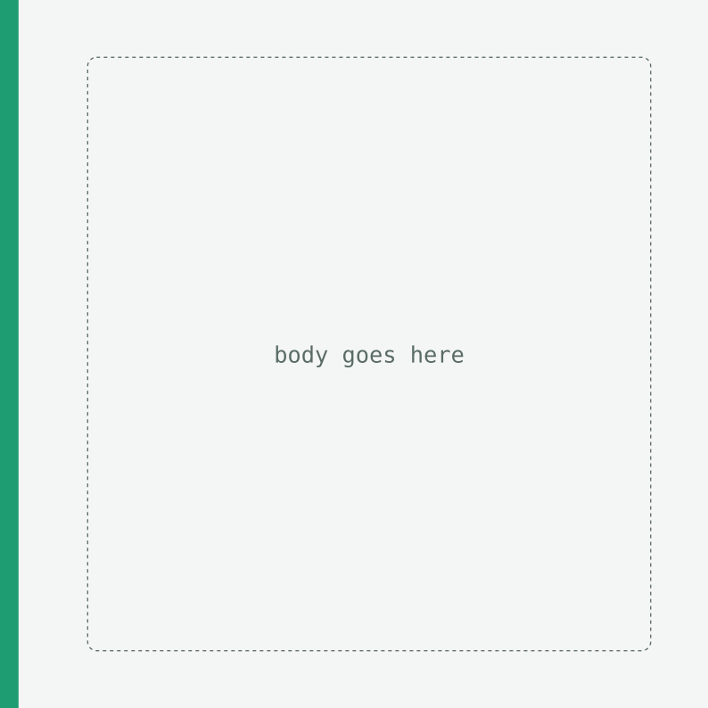
A slide helper can do more than add padding. It can also draw the parts that repeat on every card. The layout below draws a full-height accent rail down the left edge, adds a page number in the top-right corner, then lays out your content in the space that is left. Here it is, defined and then called with an empty body so you can see the rail and the padded area where body goes.
Start a fresh page and paint its background with fill, so each call is one card in the carousel.
2
Draw the rail: a thin rectangle pinned to the left edge, the full height of the page. With margin: 0cm it reaches the top, bottom, and side.
3
Add a small page number like 2 / 3 in the top-right, but only when an index is passed.
4
Add back the padding that margin: 0cm removed, with a wider left inset so the content clears the rail.
5
body is a trailing content argument, so the helper is called as #slide({ ... }) with the card’s content in the braces.
The helper is optional: a bare #page(...) would work too. Defining slide once is what keeps the rail, the page number, and the padding identical on every card, and every call site short.
Define the layout once, and every card matches without repeating the setup.
The page geometry, a small palette, the fonts, this slide layout, and a ruled kicker label are the file’s setup. In this post they live in a shared preamble, so each live example below shows only the card it draws.
Slides, live
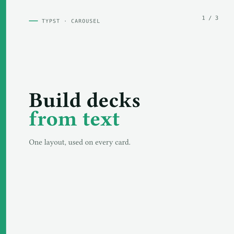
The cover card passes an index, adds a kicker at the top, and centres the headline. The rail and the page number come from the layout.
Each card renders as a true square, so what you see is what the feed will show.
Compile the whole deck
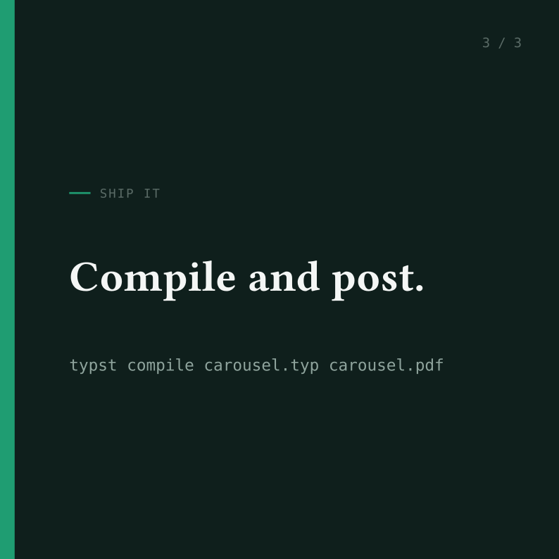
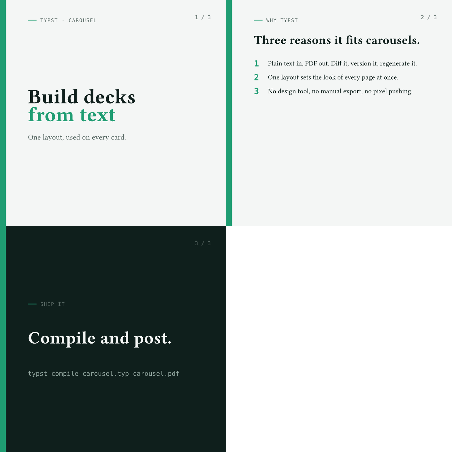
Stack your slides in one carousel.typ file, then compile it. Each #slide(...) becomes one page, and the PDF is the carousel.
# Each #slide is one page; the PDF is the carouseltypst compile carousel.typ carousel.pdf# Typst can also export one PNG per page, no extra tool neededtypst compile carousel.typ "carousel-{p}.png"--ppi 144
Upload carousel.pdf to LinkedIn as a document post, and keep the PNG frames for a preview.
Want a GIF for another platform?
LinkedIn takes the PDF, but some places want a GIF. Build one from the PNG frames with ImageMagick.
# Assemble the exported PNG frames into a looping GIFmagick-delay 250 -loop 0 carousel-*.png carousel.gif
-delay 250 holds each frame for 2.5 seconds, and -loop 0 loops forever.
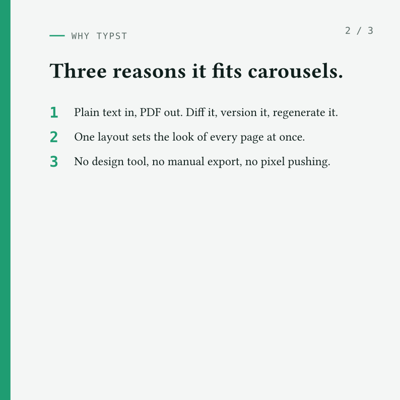
Here is this post’s deck as a looping GIF.
TipA few design tips
Keep body text at 14pt or larger so it stays legible at thumbnail size.
Aim for five to seven slides: a cover, the content, and a closing call to action.
Use one visual idea per deck: a palette, a font pairing, a single motif.
Avoid copy-pasting the previous carousel, so each one looks different.
Bonus: an LLM prompt
If you would rather start from a draft, paste the prompt below into your assistant of choice. It encodes the geometry, the slide helper, and the design constraints, so the output compiles with the typst CLI.
You are designing a LinkedIn carousel as a Typst document.Produce a single self-contained carousel.typ that compiles with `typst compile`.Hard requirements:- Page geometry: #set page(width: 21cm, height: 21cm, margin: 0cm). This is a square 1:1 (LinkedIn shows carousels at 1080 by 1080); keep the ratio.- Define one `slide` layout and use it for every card. Build it from a full-page block with zero page margin and an inset, so the background reaches every edge and the content keeps consistent padding: #let slide(fill: <default-bg>, body) = page(fill: fill, { block(width: 100%, height: 100%, inset: 1.7cm, body) }) Add any repeated parts you want on top of that (a header, a page number, ...).- Invent a small palette (background, ink, soft ink, one accent) and a font trio (display, body, mono). Prefer legible fonts.- Five to seven cards following the arc: cover, then content, then a closing call to action. Use one card with `fill: <accent-or-dark>` to invert the look.- Body text at least 14pt; headlines 30 to 56pt, so everything reads at thumbnail size. Use place, grid, stack, and v()/h() for layout.Then tell me the two `typst compile` commands to export it to PDF and to one PNG per page.The topic of the carousel is: <describe your announcement here>.Layout and style (optional): <describe any layout or look you want, for example a side rail, page numbers, a colour band, a serif or a sans display; leave blank to let you pick a clean design>.
It comes down to one idea: a single slide helper turns a blank page into a carousel page, and the rest is the content you put on it.
Now build a deck for your next post. If you make one, tag me on LinkedIn so I can see it.