Gribouille 0.6.0: Wrangling Data and Breaks That Land on Round Numbers
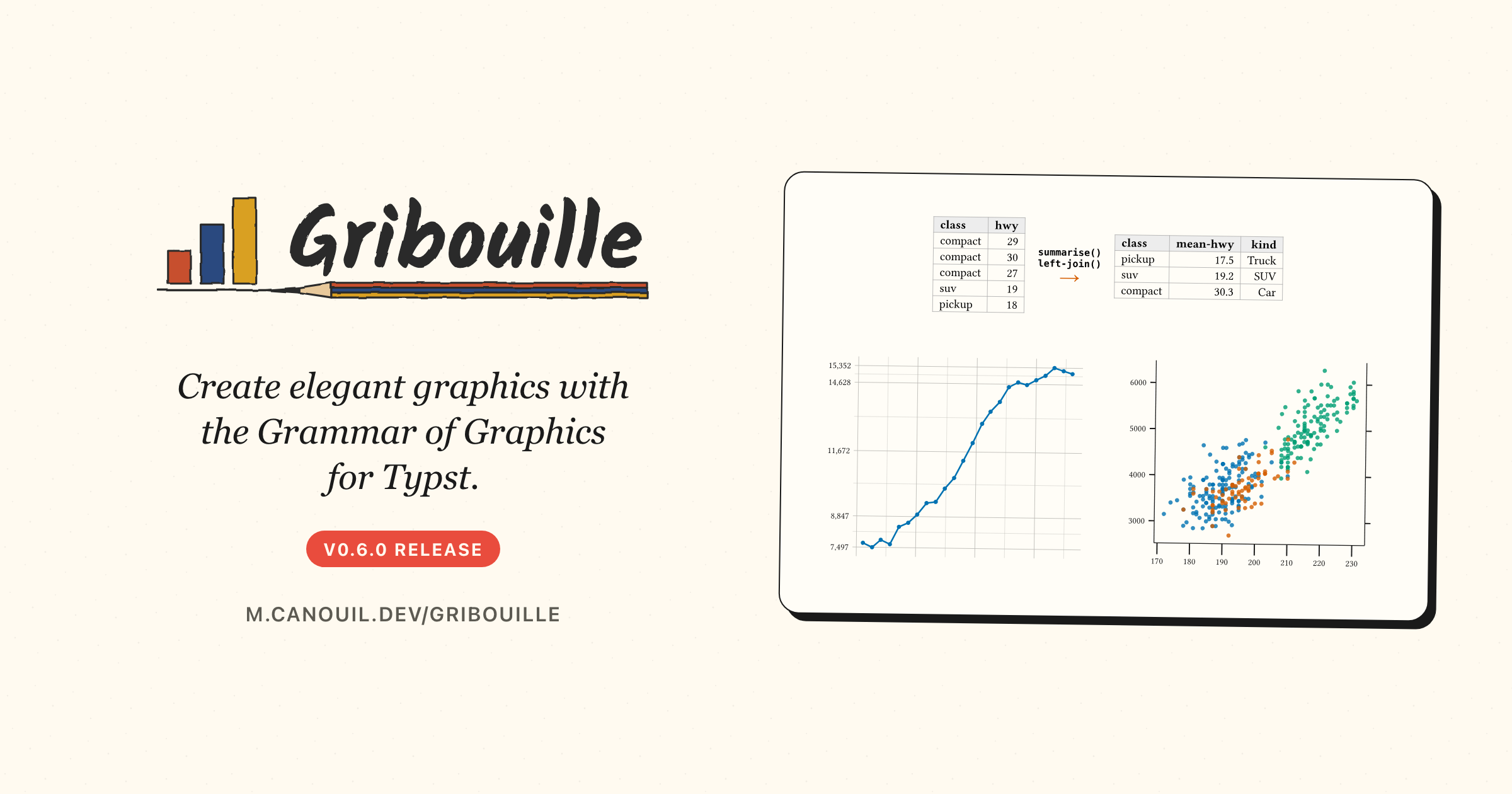
Gribouille 0.6.0 adds an experimental set of data wrangling verbs, so grouped aggregation, reshaping, and joining happen in the document instead of in a script you run beforehand. Automatic axis breaks now come from the extended Wilkinson search, and breaks-width(), breaks-pretty(), breaks-extended(), and breaks-quantile() let you place them yourself. Axis ticks are themed through a single element-tick, which is the breaking change of the release. The documentation fills its gaps too, with a new wrangling guide, a section on tick theming, and complete argument tables on every scale page.
Gribouille 0.6.0 is about the data before the plot, the numbers along the axis, and documentation. A set of wrangling verbs brings grouped aggregation, reshaping, and joining to the row-store data model, so the preparation stays in the document. Automatic breaks now come from the extended Wilkinson search, which puts ticks on rounder numbers closer to the data, and four breaks-* helpers let you place them yourself. The one thing to watch when you upgrade is the tick theming: tick-length and tick-labels are gone, replaced by a single element-tick.
NoteAt a glance
Gribouille 0.6.0 on Typst Universe: #import "@preview/gribouille:0.6.0": *.
summarise() and count() aggregate a dataset per group, one output row per group.
left-join() and the other four joins combine two datasets on their shared key columns; bind-rows() and bind-cols() stack or glue them.
select(), rename(), relocate(), drop-na(), distinct(), and slice-max()/slice-min() handle the column and row work that a bare .filter() states awkwardly.
The verbs are experimental, and the Wrangling data guide says when native Typst is enough on its own.
The documentation fills its gaps: the new guide above, a “Ticks and their labels” section in the theming guide, and every scale-* page listing the keys its ..args accepts, oob included.
Breaking: tick marks are themed through the axis-ticks family with the new element-tick(colour:, stroke:, length:); tick-length and tick-labels are removed.
Breaking: the internal summary-dispatch kernel gives up the summarise name to the new verb; stat-summary(fun:) is unchanged.
Every figure in this post is a real, freshly compiled plot.
1 Breaking changes
Two names change, and only one of them is likely to be in your documents.
WarningMigrate these names
Tick marks are one theme record now. element-tick(colour:, stroke:, length:) carries the mark length, so tick-length and its per-axis and per-side variants are removed: write axis-ticks: element-tick(length: 0.2cm) instead. tick-labels is removed too, because tick labels live in axis-text, so hide them per side with axis-text-y-right: element-blank(). To drop the marks and the space they reserve, axis-ticks: element-blank() is the one switch.
summarise is the wrangling verb described below. The summary-dispatch kernel that used to carry that name is internal now. If you passed a summary by name or by closure to stat-summary(fun:) or stat-summary-bin(fun:), nothing changes.
2 Wrangling data
A Gribouille dataset is a row-store, an array of dictionaries with one dictionary per row. That is a plain Typst array, so a good part of the preparation is already a one-liner: data.filter(...) keeps rows, data.map(...) derives a column, data.sorted(key: ...) orders them. What Typst leaves open is grouped aggregation, reshaping, and joining, and that is what the new verbs do. They all take a row-store and return a row-store, so the result goes straight into #plot with nothing in between.
WarningThese verbs are experimental
Their interfaces can change without notice while the design settles, and they may end up in a dedicated Typst data-wrangling package rather than in Gribouille. The plotting API and the native array methods are not affected.
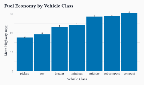
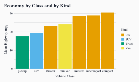
summarise() collapses each group to one row. The grouping is per call, through by:, so there is no grouped state to remember to undo[^If you are a dplyr user, you know what I am talking about.]. Each aggregation is a closure that receives the group’s rows and returns one cell, so anything you can compute over the rows is fair game.
Every named argument is an aggregation: a closure over the group’s rows returning a single cell. A mean, a count, or a ratio of two columns all fit the same shape.
2
by: takes one column name or an array of them; without it the whole dataset collapses to a single row.
3
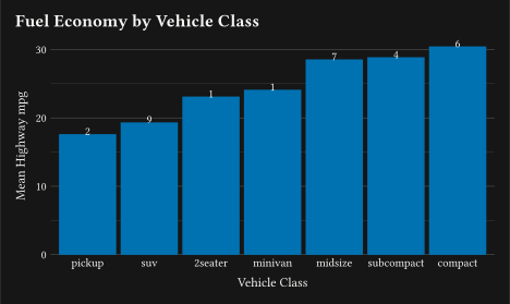
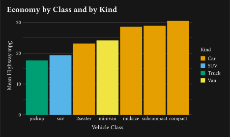
The output is an ordinary row-store, so .sorted() orders it, and feeding that order back as the discrete limits keeps the bars sorted.
4
n is one of the aggregated columns, so it can be mapped like any other.
When the aggregation is just a tally, count() is the short form: it groups by the columns you name, adds an n column, and sort: true orders the groups from most to least frequent.
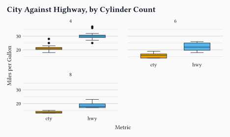
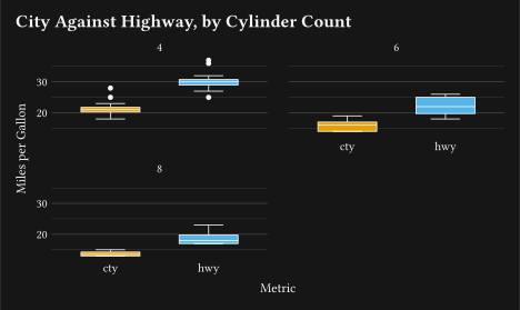
Two columns that measure the same thing are usually easier to plot once melted into one value column with a label column beside it. pivot-longer() does that, and pivot-wider() spreads them back.
The columns to melt. Each row of mpg becomes two rows here, one per measurement.
2
names-to names the column holding the old column names, values-to the one holding their values.
3
The columns that were not melted, cyl among them, are carried through, so they can still facet or colour the plot.
Enriching a dataset with a lookup table is a join, not a dictionary read per row. Build the lookup as its own small row-store and left-join() it on the shared key.
The lookup is a row-store like any other, written inline here, read from a CSV just as well.
2
Every row of the left dataset is kept and gains the lookup’s extra columns. inner-join keeps only the matched rows, full-join keeps both sides, and semi-join/anti-join filter the left dataset without adding columns.
Every verb takes a row-store and returns a row-store: the result of a summarise, a pivot, or a join goes straight into #plot with no adapter in between.
One more thing before the plot, for real files. A CSV arrives as strings, and missing values are spelled in as many ways as there are people producing the files. as-numeric() now takes an na: list of sentinel values, blanking them before it parses, so a placeholder does not survive as a number.
The Wrangling data guide walks the whole path, from coercion to the plot, and it also says which tasks need no verb at all.
3 Breaks that land on round numbers
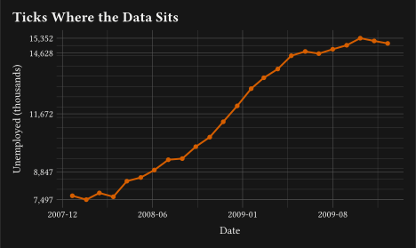
Until now, automatic breaks came from a fixed 1/2/5 ladder: pick the step from that list, cover the range. It is simple, and it is regularly a bit off, either too far from the data or with more ticks than anyone asked for. 0.6.0 replaces it with the extended Wilkinson search [@talbot_extension_2010]GitHub, which scores candidate tick sequences on three things at once: how simple the numbers are, how well they cover the data, and how close the count lands to the target. There is nothing to change in your code, plots come out with rounder ticks that sit closer to the data.
The same search is available as breaks-extended(n:) when you want a different tick count. It is one of four helpers that build a closure for the breaks: and minor-breaks: arguments of a continuous scale. The closure is called with the values the scale trained on, once per panel, and returns the positions, so free-scale facets each get their own.
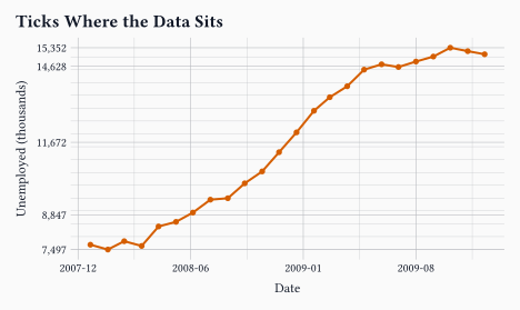
breaks-quantile(probs:) puts the ticks at sample quantiles, the quartiles by default, so the axis reports where the mass of the data sits instead of drawing a regular grid.
2
minor-breaks: takes the same closures. breaks-width(width, offset:) places a line every width, anchored on offset, so the positions stay on round multiples however the range moves.
3
The tick labels are formatted by format-comma(), unrelated to where the ticks sit. breaks-pretty(n:) is the fourth helper, for round positions at a target count.
A closure and an explicit array of breaks are not treated the same way, and the difference matters. An explicit array widens the axis so every requested tick stays visible, while closure breaks are clipped to the trained domain, since the closure has seen the data and cannot ask for anything outside it.
A related fix landed with them. A scale trained on whole numbers only, such as years or counts, now keeps whole automatic breaks, so a narrow range like 2020 to 2023 no longer labels half-steps.
4 Ticks, in one element
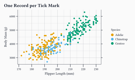
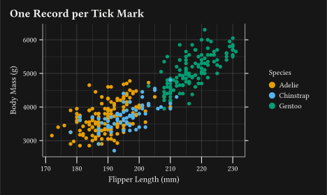
Tick marks used to be described in two places: their colour and stroke in axis-ticks, their length in a separate tick-length with its own per-axis and per-side variants. They are one record now. element-tick(colour:, stroke:, length:) carries all three, on axis-ticks and on its per-axis, per-side, and minor variants.
dup-axis() repeats the axis on the opposite side, and its breaks: and labels: are honoured now; the secondary axis used to draw the primary ones whatever you asked for.
2
Length, colour, and stroke sit in the same record, set once on axis-ticks for every side.
3
A ratio scales the length inherited from the parent surface, exactly as size and stroke do elsewhere, so the y marks come out half as long without naming an absolute value.
4
Tick labels live in axis-text, so hiding them per side is the usual element-blank(), and the width they reserved goes back to the panel.
Minor marks follow the same record through axis-ticks-minor. The sub-decade ticks that guide-axis-logticks() adds on a log axis used to be hardcoded at half length in the major stroke; they are themable now, and they inherit the major record, so the default look is unchanged.
One record, one switch:element-tick holds the colour, the stroke, and the length, and axis-ticks: element-blank() turns the marks off without reserving any depth.
5 Under the hood
The usual share of fixes rides along.
The one you are most likely to notice is vertical alignment of labels (#208GitHub). Legend entries, vertical colourbar tick labels, and y-axis tick labels now centre on the cap-height and baseline band instead of the glyph bounds. A label carrying a descender, Chinstrap next to Adelie, no longer sits a little higher than its neighbours.
6 Filling the documentation gaps
A good share of this release was writing down what was already there.
The reference pages had a real hole in them (#211GitHub). A scale-* constructor takes ..args, and the page described a few of those keys in prose, which left the rest to be found by reading the source. Every scale-* page now lists each key it accepts, with its type, its accepted values, and its default. That includes oob, the out-of-range handling, which no page documented at all.
Cross-references are links again. A reference that closed a parenthetical printed as a bare @geom-line instead of a link, and a link sometimes ran into the word or the comma before it.
Two guides changed. The Wrangling data guide is new, and it starts where the data does: coercion, then grouped aggregation, reshaping, joining, and the plot at the end. It also lists the tasks that need no verb at all, because filter, map, and sorted already do them. The theming guide gains a “Ticks and their labels” section covering element-tick, ratio lengths, minor marks, and hiding labels per side.
The site itself got a pass for legibility. The GitHub icon in the navbar is a widget now. It shows the live star and fork counts and opens a project menu: repository, issues, pull requests, releases, star, fork, Typst Universe, and sponsoring. It replaces the separate links that used to sit in the navbar, and it shares one pill button style with the version switcher, the search button, and the scheme toggle.
7 Wrap-up
Prepare the data in the document, and let the axis pick better numbers.
Next on the list is more geoms and more worked examples. If you run into something unexpected, the issue tracker is the right place for it.
Gribouille is an unfunded spare-time project, and the API is still settling. Bug reports and ideas are very welcome on the issue tracker. Pull requests are not being accepted for now, for the reasons set out in the launch post. Thanks in advance for your patience.